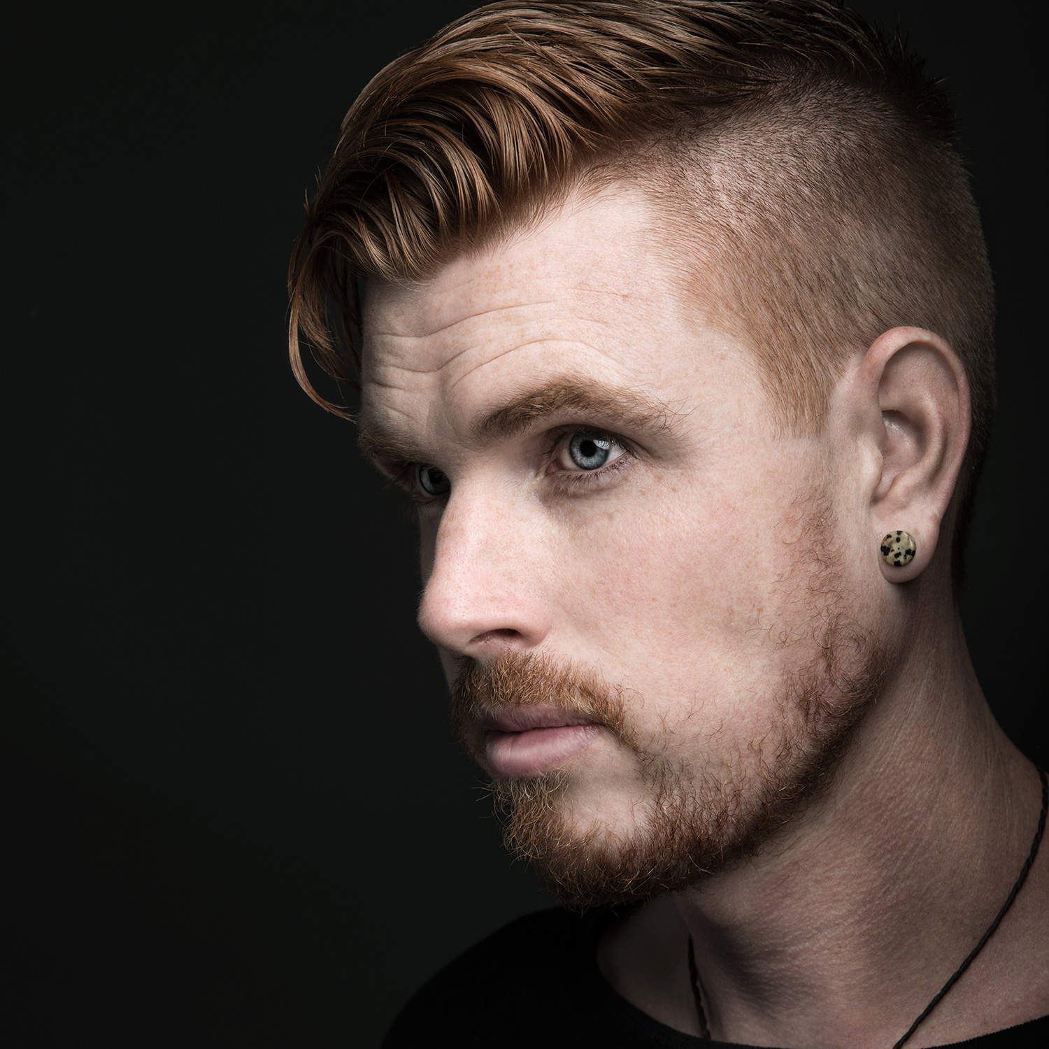
Behind the Image - Lisbeth Splawn
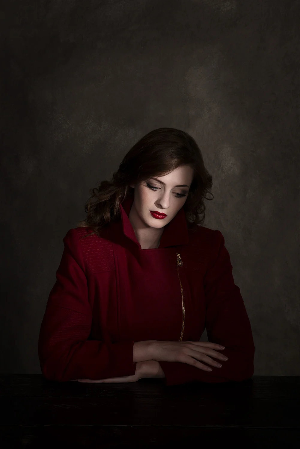
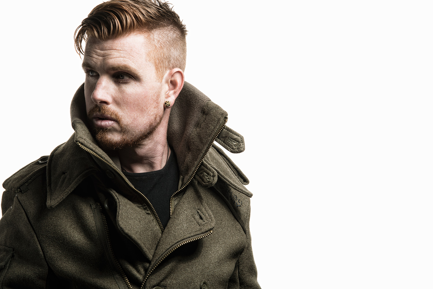
We recently had the pleasure of working with Model and Actress Lisbeth Splawn. The goal was to create moody, vintage portraits with a Dan Winters meets Aaron Anderson look. If you aren't familiar with Dan Winters work I would highly recommend you take a look at his website: www.danwintersphoto.com
One of the great and unique parts of this shoot is the DIY aspect. Both the background and table were made specifically for this shoot, and I'll talk a little bit about how it's done in the video. Check out the videos below and see how it's made, then keep scrolling to see the final images from this shoot!
Thank you guys for following and if you have any questions don't hesitate to shoot me a message...until next time, be awesome!
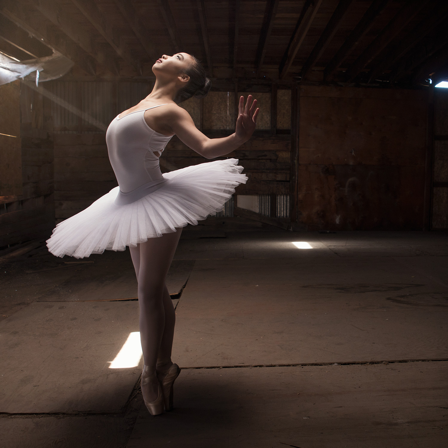
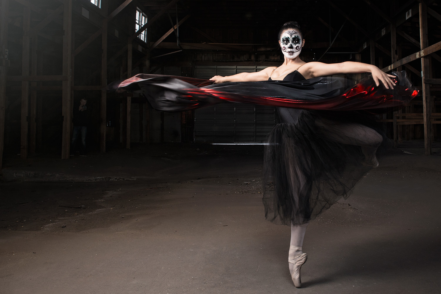
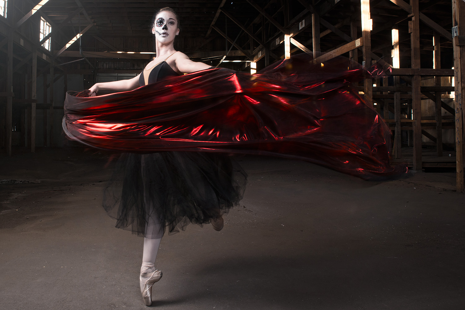
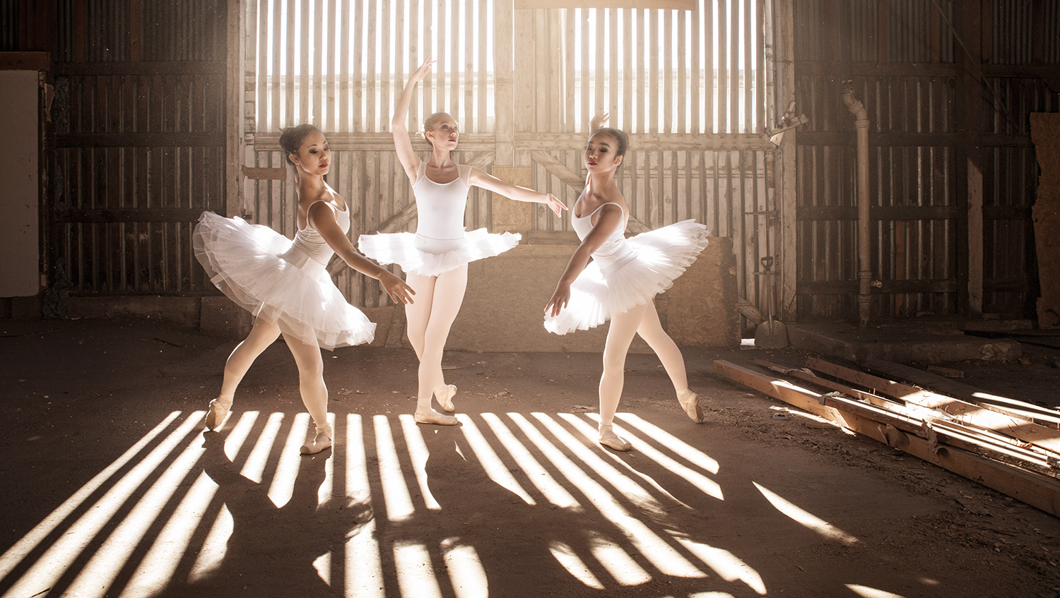
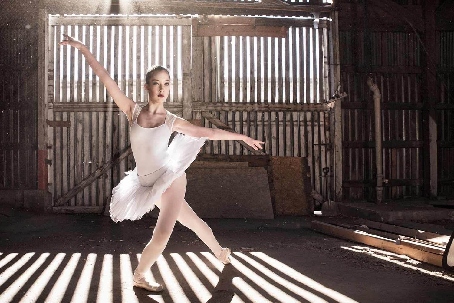
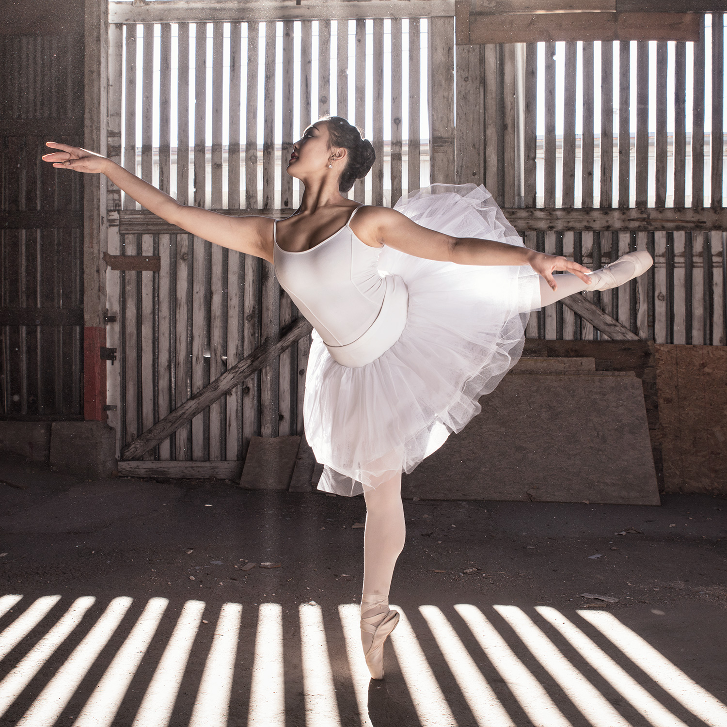
Ballet meets Dia de los Muertos
My team and I just finished an incredible shoot last week and I wanted to share the results with you. We were able to shoot at a beautiful location in Colorado Springs (abandoned locations are by far my favorite type of backdrop). If you add in 3 amazing dancers, 2 very talented MUA's (Tasha Ditchman and Molly Hardee) on site working all day, assistants and lots of lighting, you get some pretty awesome stuff.
Below you'll find the BTS video (Filmed and Edited by Andrew Forrer) to give you an idea how much work goes into a shoot like this, and some of the images that we ended with.
Thanks to my incredible team and I hope this inspires you to dream big...now, go be awesome!
See the light.
I have had a number of people ask me if I would be putting tutorials up on my page, and that is definitely in the works for 2016, but I think there is a fundamental problem with a lot of people trying to break into composite photography, and that's lighting. Sometimes I think our digital crazed culture has become so reliant on the term "fix it in post" that we forget the little things that make photography special.
When you look at some of the great photographers before us, like Henri Cartier-Bresson and Ansel Adams, you realize that they saw light, it didn't just happen to them and it most certainly wasn't luck. You might be asking, what do two guys who shot mostly black and white film have to do with a digital composite photographer in 2015?! To that I would say, everything! I have had multiple people come to me and ask how I make my composite images look so real, and yes, I use Photoshop a lot, but Photoshop can only do so much. I think most of what makes composite images look real is lighting. More specifically being able to identify lighting and re-create it.
So, what can you do? How can you start to learn about lighting? Well the first thing you can do is go outside! Look at shadows, haze, highlights, soft light, hard light, night lights, natural light, artificial light, fog, etc. and study them. The more you know about what light looks like the better. That's the fun part, I am still obsessed with shadows and I take pictures of them all the time...it's a little weird. I can't stop it though, I think light is incredible and beautiful, I think at the heart of what we do is the fact that photographers love light.
What do you do after that? You learn how to make it. First, learn how to make light and shadows in a studio. This part can be harder if you don't have access to lights, but it most certainly can be done on a budget. This is a critical step if you want to be a composite photographer because your ability to take an object and put it seamlessly into a background is what will set you apart from the competition. There are a ton of tutorials that you can look at online, like kelbyone.com, that will teach you lighting, but make sure you don't just watch videos, go do it!
Finally, you need to learn how to make lighting and shadows in Photoshop. I think this is where things get a little backwards for a lot of people. I can't tell you how many people have said the know a ton about Photoshop and still can't make their images look right. Honestly, if they really do know a ton about Photoshop (I have my suspicions), it's probably the lighting. I think if you just try to learn Photoshop without learning lighting you are doing yourself a disservice, and it makes things very frustrating in the beginning. When you're ready though, there are a ton of websites and resources to help you learn about lighting in Photoshop (Phlearn, Lynda, Kelbyone, Youtube, etc).
I might be crazy, but I think you need to know this stuff to be a professional photographer, not just have a nice camera. I mean, having a nice camera is great and all, but I would rather hire a photographer with a cheaper camera who knows what they're doing then one with a super expensive camera who doesn't have a clue.
I just recently went in the studio and did test lighting for a shoot that I am getting ready for and to learn more about lighting, because you never know it all! Below are some of the shots that I took from new lighting set ups I am working on, and a little bts video of me running around taking pictures of myself! Until next time, be awesome!
Personal Project - The Dolls
A while ago I did a personal project called "The Dolls Have Eyes". I had originally shown these on my old blog but that has been taken down so I wanted to put them up on the new page for you guys to see!
The idea was relatively simple, take pictures of dolls and morph them together with human features. What I wanted to see was if people could tell, if they knew they were looking at a doll with some real feature. It's my exploration of how a lot of what we see in media today isn't real at all, and if it seems to good to be perfect to be true it probably is!
Hope you enjoy it, or you think it's creepy...either one :) Until next time, be awesome!
Never. Stop. Creating.
There is something that keeps coming up among the creatives that I have around me, and I thought it was worth sharing with the 3 people that read this blog (not counting my mom).
The idea is this: don't stop creating work and new imagery (video, illustration, etc), even if no one is paying you. I know what you're thinking, make stuff for free?! Blaspheme! But I think you'd be surprised how much free work top tier photographers do, both for themselves and in collaboration with other artists. But why? What's the logic? It's simple, when you aren't getting paid and there is no client you create things that you WANT to create. There is no one telling you to change the lighting, to move this person or that, it's just you and your vision. I have found that is when the most dynamic work comes out, when it's for you.
Recently I did a personal project I call "Tired people drinking coffee". It was probably the most fun I have had in the studio for quite sometime. What was different from my normal routine? I didn't make them composites, I focused on grass roots lighting and fun photoshop techniques. What inspired me do it? Two things, we just had our second baby, so I am exhausted, and I love coffee...especially after the second baby :) It was designed to be fun and that is exactly what it was. Funniest part about it is that the series has received more recognition than most of the commercial work I have been doing...ironic isn't it?
I will leave you with this idea: How do you ever expect to get the clients you want if you only make work for other people? Create a portfolio you love, work with people that inspire you, and most importantly...be awesome.
Re-Banding: Hydrogen Skyline
You've heard of re-branding before...well this is kind of like that. A little white ago I sat down with the band Hydrogen Skyline (www.hydrogenskyline.com) and talked to them about creating a new image for their band. I wanted to share in this blog what came from that collaboration and a little behind the scenes at some of the composite work I did.
Before I get to the images I wanted to take a second to talk about collaboration and a couple of things to help you get started!
1. Bring something to the table - We literally sat around a table at a coffee shop when talking about this project and everyone brought their ideas to share. Don't be the person in a collaboration to show up to the table empty handed, bring ideas, bring good juju, bring something!
2. Be Flexible - Don't bring ideas that are not flexible to the table and be willing to have ideas shot down, especially to meet the needs of the client. We all think our ideas are the best ideas, it is an unfortunate truth that a lot of times they aren't...but that's why you collaborate, so if your ideas suck someone can help make them un-suck.
3. Do your homework - The other day I sat down to have a meeting with a potential client and they hadn't even looked at my website, they had just heard I was good. Not only was it insulting to me, but it was a waste of time because they didn't know what I specialized in. Before I met with the band I had looked at other band album covers, seen what was popular in their genre, and come up with ideas that would work for both of us...they had done the same. Don't be too cool for research and homework, you're clients will appreciate it!
Alright, enough tips...let's look at some pictures! Hang on for the last one it will show an animation of the composite.
Until next time, go collaborate with someone and BE AWESOME!

